

Opacity in paint: Why do some colors cover better than others?
- Angel de cours de peinture Mixarts

- May 8
- 4 min read
Why do some colors cover better than others?
Why do some colors cover in a single brushstroke, while others require several coats to completely hide the canvas?
👉 It's not a lack of talent.
👉 It's not the quality of the paint.
It's opacity. And understanding it can completely transform the way you paint.
Why opacity changes everything in painting
Once you know whether a color is opaque or transparent, you no longer paint randomly. You make smart choices.
Opaque Colors
Ideal for covering, correcting, and simplifying your work.
Perfect for blocking in shapes or quickly hiding a mistake.
Transparent Colours
They don't cover... and that's precisely their strength.
Perfect for creating subtle, luminous, and natural effects.
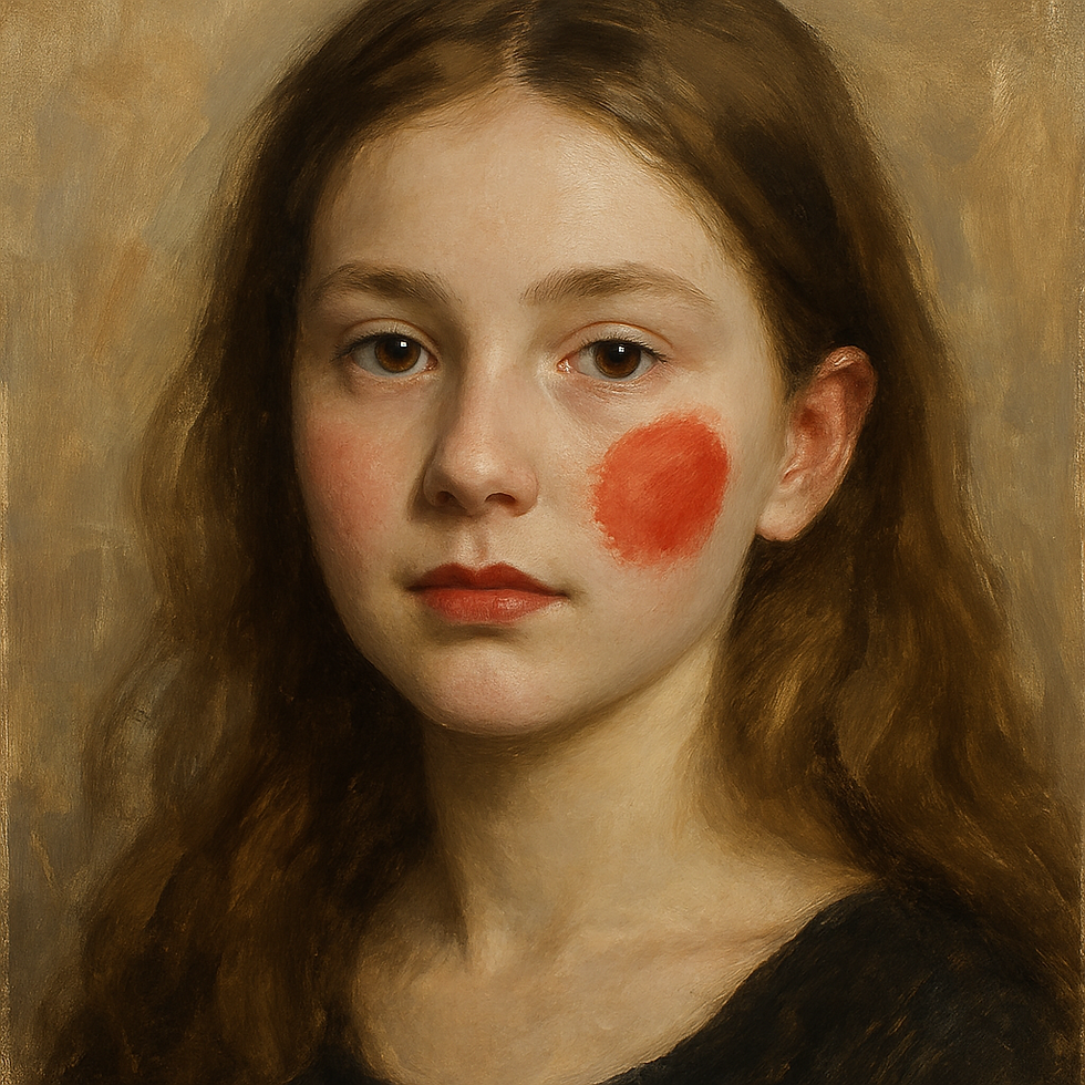
Example: In a portrait, a transparent red gives a soft warmth to the cheekbones, while an opaque red creates an artificial effect.
Ideas about transparent colors
❌ Many beginners think that paint that doesn't cover well is poor quality.
👉 Wrong. Very often, it's simply a transparent color that does exactly what it's supposed to do.
⚠️ However, if a color advertised as opaque (e.g., titanium white) doesn't cover well, this could indicate a lower-quality pigment with too much binder or filler.
How to read the information on paint tubes
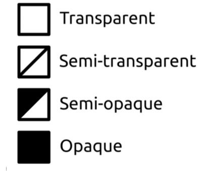
Opacity symbols
On tubes, you will often find:
O = Opaque,
SO = Semi-opaque,
T = Transparente.
Or small graphic symbols indicating the cover.
Example:

Why is this important?
To know if the paint will properly cover the background
To create glazes
To avoid surprises when layering paints
To work with transparency
To create shading
Transparent pigments are not necessarily of poor quality. They allow light to pass through and are worked differently from opaque colors. They are yet another tool at our disposal as artists.
Concrete example of use opaque vs transparent
Here's a very concrete example of using transparent versus opaque colors: A transparent red (left side) gives a natural effect on a child's cheek, while an opaque red (right side) gives a "clown makeup" effect. Opaque and transparent colors each have their uses.
The colors are available in opaque and transparent versions.
Several shades, or shades close to them, can be obtained in either opaque or transparent form. Generally speaking, regardless of the color—yellow, orange, purple, etc.—there is often an opaque, transparent, or semi-transparent version available.
Opaque white and transparent white
You can obtain both opaque and transparent white: Titanium white PW6 is opaque and
Zinc white PW4 (also known as mixing white) is transparent.
Here's an article that discusses the difference between titanium white and zinc white >>> https://en.cours-de-peinture.ca/post/what-is-the-difference-between-titanium-white-and-zinc-white

Download the free guide – How to decode a paint tube
🎨 Join our community of painters
Do you love to paint and want to improve without making things complicated?
Receive clear tutorials, practical advice, and simple tips directly in your inbox to improve your results, whether you're a beginner or intermediate artist.
Become part of a community of passionate artists who progress together, one brushstroke at a time.
👉 Sign up for free now
✔️ New tutorials
✔️ Easy-to-apply practical tips
✔️ Tips to avoid common mistakes
✔️ Inspiration and motivation to keep painting
👉 By signing up, you'll also receive exclusive resources reserved for subscribers.

This notebook will save you time and prevent you from wasting paint
note the exact colors you used for each of your art works,
keep all your color recipes together, so you never forget them,
keep all your inspirational photos and images with artist name and website information in one place for fast and easy reference.
So stop wasting time and paint trying to remember how to recreate a colour.
Get this practical artist's notebook, created by an artist for artists.
This notebook helps you free your mind of these details so you can concentrate on your creativity.
You can use these link depending on your location:
CANADA - CA : https://www.amazon.ca/dp/B0BS8ZZWHM
France - FR : https://www.amazon.fr/dp/B0BS8ZZWHM
USA - US : https://www.amazon.com/dp/B0BS8ZZWHM
Deutsch - DE : https://www.amazon.de/dp/B0BS8ZZWHM
Espagne - ES: https://www.amazon.es/dp/B0BS8ZZWHM
Italie - IT : https://www.amazon.it/dp/B0BS8ZZWHM
Nederlands - NL : https://www.amazon.nl/dp/B0BS8ZZWHM
日本語 - JA : https://www.amazon.co.jp/-/en/dp/B0BS8ZZWHM
Australie - AU: https://www.amazon.com.au/dp/B0BS8ZZWHM

How to enlarge all your drawings to scale without doing any calculations
How to guide to enlarge your drawings to reproduce a subject on a canvas with precision, without knowing how to draw and without having to take out your calculator.
Get more and stay informed
Subscribe to our Youtube channel to stay updated on new videos.
👉 YouTube
To learn more about our Painting Classes, visit:
Join the Facebook group:
Discover articles on painting techniques on our blog:
👉 BLOG Mixarts Painting Courses
To learn more about our online courses:


Comments